Week 5: Final Selection and Evaluation
Updated: Dec 11, 2022
Group Critique


We were divide into groups of four for our group critique wherein we discussed places for imporvement and one such area which the group considered as postcard.
This is the area that my group considered as postcard since it has details with tone and texture. They recommended to edit certain lines and edges in the drawing digitally (or physically if possible).
I can improve this are by adding few proper details and giving proper shading to the other door (Which is upside down) using charcoal.
Additional Development work

This is the start of my concertina sketchbook. I wanted to follow the lines from the mark making technique and create a scene. This lead to the formation of different tone and texture with the involvement of nature. Since the branch extending from the tree looks surreal, I started continuing my concertina sketchbook into the concept of surrealism.

I drew certain architectural structure that were not made out of simple building tools and continued including nature. There are so many architectural structures that are built with out disturbing nature which is why I wanted to include trees, bushes or plants into my concertina sketchbook. And also make structures that are inspired by nature i.e., Biophilic Design.
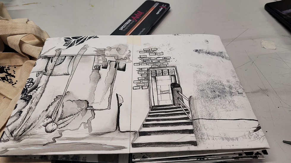
I wanted to incorporate some of my photos into the concertina sketchbook so i took inspiration from my photos and combined them. And to keep the surrealism concept I placed the door upside down. Here I tried to focus on the details and add some of my design to it.
My final concertina sketchbook

Final Postcard Collection
My postcard collection is inspired by Gothic design and Viktoria Kravchenko's Work. It includes natural elements and surrealism which I would like to make as a part of my project. Since I was always fascinated by Biophilic design I have included certain structures that seem as though they are part of the woods in one of my postcards. The organic elements in black and white give an eerie feeling which is similar to gothic aesthetic (In the image shown below).
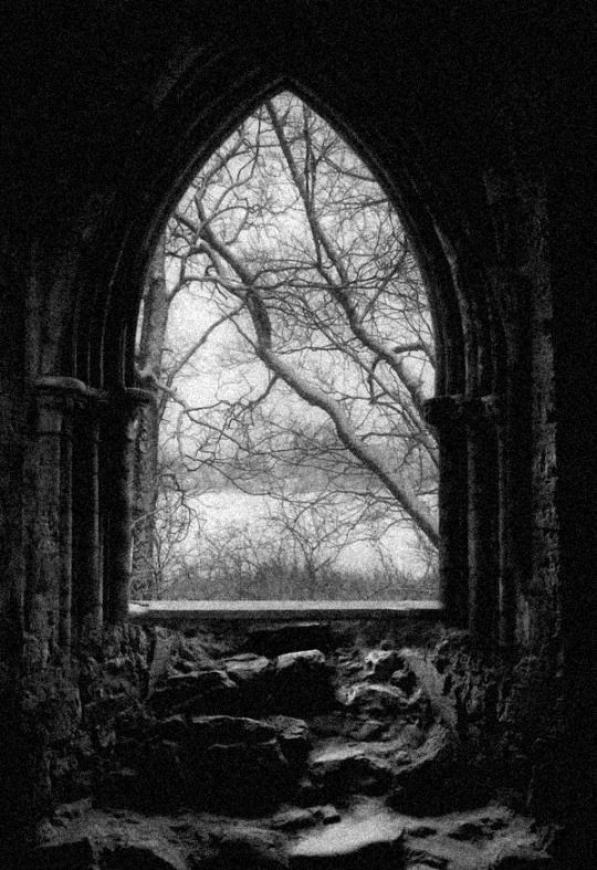
I used Photoshop to make few areas clear white. The texture seems to be rough resembling a rock which I have not disturbed but Highlighted in the first postcard. To bring out different tones I used charcoal pencils and for the details I have used fine liner pens.
Reflective Video


Comments